How I fell in love with low-js
About 5 years ago I was working on a project written in style still common for today:
- python backend serving a REST API (public btw)
- SPA using framework-of-the day
And it was horrible. Not to mention that the framework-of-the-day did not actually take off and we ended up using something very fringe - there were real performance and complexity problems. And to this day I believe all our problems stemmed from the base architecture. There were just too many layers, each contributing overhead. Both in execution speed (aka “app is slow”) and development speed (“our velocity is too low”).
Let’s look at a more concrete example. What happened for a typical page load (assuming navigation, otherwise it starts by loading multiple mb of js)
- JS router detects navigation and updates components
- components fetch needed data
- this turns out to be tens (sometimes hundreds!) of requests because the general API is very normalized (yes we were discussing GraphQL at this point)
- then throw most of this data (95%+) away since we don’t really need all those fields (yes yes, GraphQL again…)
- render templates in JS with the processed data
- shove the results in the DOM
…meanwhile the user is impatiently twiddling their thumbs. Sounds familiar? Because this was by far not the only app I’ve seen with this problem. Surely we can do better…
Luckily I had a colleague with Ruby on Rails background. And he was a big fan. Quite loud about how plain old server side rendered pages were much simpler and faster too. It all made a lot of sense so I made a prototype. The above flow was now:
- flask router directs a request to a controller
- controller constructs a query (we already had a query and serialization layer available)
- exactly the data that is needed (column selection) is fetched
- then passed through a presentation layer that makes the view models
- jinja template is rendered
- html returned to the browser
And I be damned, it was faster! A lot faster. If you think about it it makes a lot of sense. It looks like about the same just looking at the line items but it’s actually performing a lot less work and more importantly there is less communication (and thus latency). And the best part? It was also a lot faster to work with. Mostly due to fewer moving parts, so each change needed to touch less places. After all I managed to cobble the prototype together in a single day.
So we went all in on this approach and shipped (a much better version of this) to production to replace a core component of the product (as an opt-in v2 - I’m not completely insane…). Smashing hit. Feature parity in no time, even new feature were added very quickly. Less bugs, better performance, happier customers.
So where was the problem? Sounds like a tall-tale not a real story from the trenches. Well there were hacks. Like “preserving” the scroll position. Or tracking whether a modal is open in the url. But the real issue was the user experience. The fidelity was much lower. Everything looked a bit more crude, some things like switching “tabs” took surprisingly long (obviously since it was a full page refresh) or there was jarring page blinking. Where is my autocomplete? Where are the smooth transitions? Where has my multiselect choice gone, I just change the filter a bit?
The technology (even just turbolinks would be a big improvement) to fix all this with minimal effort was there (I now checked release years) but my mindset wasn’t. Instead I claimed, drunk on success (it really was a big success) and full of hubris, that this is the tradeoff we made to achieve all other goals.
But surely we can do better?
A few years later
Different project, different company, now focusing on purely backend services. Maybe free(-er) of my prejudices? I come across htmx and it was love at first sight. It dawned on me it’s actually quite simple to make an http request in JS and shove the resulting html into the DOM. But it’s almost trivial to do it declaratively with a small library. But by then I moved firmly into Choose boring technology camp (still here) and this looked way too fringe.
But then after a while I see Basecamp launch hey.com and claim they’re doing the whole product using this approach. Even open sourced the library - Hotwired.
But the real kicker was seeing Rails 7 launch with Hotwired as the default “frontend framework”. So maybe this approach is going (near) mainstream after all? Indeed htmx now matches some second-tier JS framworks in terms of stars, heck it surpassed our framework-of-the-day. And there’s a proliferation of tools as well. Just I few honorable mentions before moving on:
- Unpoly - an opinionated higher level alternative to htxm/hotwired turbo
- Hotwired Stimulus - for small augmentations
- Alpine.js - similar but looks pretty much like Vue
- Hyperscript - a better scripting layer for html
What am I even talking about?
Basic premise is: browsers are great at navigating pages, let’s leverage that by serving users directly with HTML. This already gives you half-decent pages but you can go further and sprinkle on some sugar. A bit of JS. Instead of reinventing the world in JS let’s try to really use what modern browsers provide natively and then push just a bit forward.
For starters: a lot can be done natively nowadays - http://youmightnotneedjs.com/
But more concretely I’m talking about taking Django/Rails/Buffalo/Play, writing a plain old server side rendered application and shoving in Htmx/Turbo/Unpoly for that little bit of interactivy that gives you things like
- immediate form validation without submitting
- modals that preserve app state (scroll positions, input fields) underneath
- responsive facet search
- pagination without page reloads
- infinite scroll
Why now just build all of this in React? Because you can vastly simplify the architecture, reduce the number of moving parts and thus boilerplate and most importantly the total effort/time to do something.
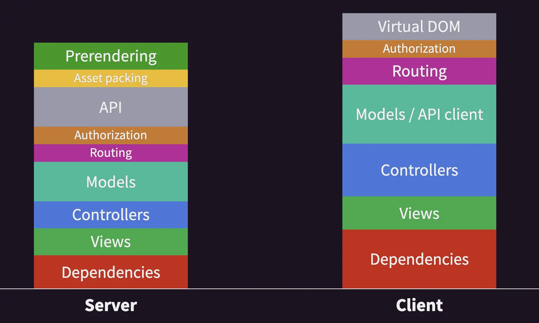
If I steal some images from the Unpoly Story you don’t want to program like it’s 2015

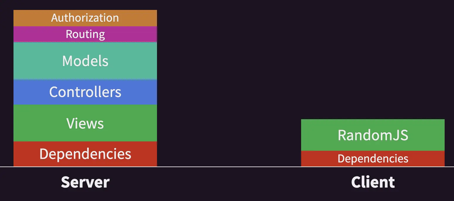
But instead more like it’s 2005

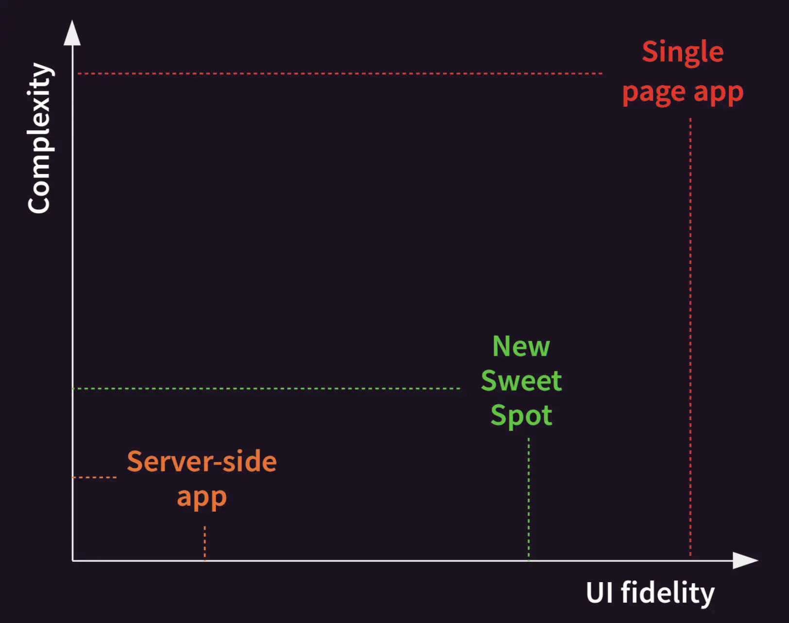
But maybe with a bit less random JS and keeping it declarative where possible. Because the main thesis is that the fidelity of the user experience follows the Pareto principle, you can get say 80% of the experience for say 20% of work.

With the imporant caveat that this does not apply to applications where heavy and smooth interaction is one of the core features. E.g. games.
My experience
I did a toy project in Go using gorilla/mux for routing and daz for templates (this one is quite out there…) with htmx for interactivity and Pico CSS for styling (I wrote a post about this part). Absolutely no javascript, miniscule amount of css, everything else written in Go.
A stark contrast to Trying out Remix where everything is JS. And I preferred it. Felt more productive. I guess this is an instance of Conway’s Law in action: frontend engineers doing the full stack prefer frontend focused tools that do backend while backend engineers prefer backend tools that do frontend. But I think there’s a technical tradeoff here as well. If your app is predominantly focused on a slick experience and you can get by with a limited backend then something like Remix is a great tool. Conversely if you’re more backend heavy and you need just a slick enough frontend then low-js approach suits you better. My hot take here is that most business apps fall into the latter category.
But what’s the actual experience like? In one word: boring. In a good way. Just like doing web pages way back when Rails was the new hot thing. Htmx mostly just gets out of the way. You sprinkle a few attributes here and there and things mostly just work.
The part I was most worried about was performance. But as far as I can see it’s better that with an SPA for most of my cases. Hear me out:
- initial page load is super fast as it’s just loading the page that is server rendered any way
- only loading 10kb of js (htmx) and even that is at the end for interactivity
- when clicking around things load in ~150ms from another region (20ms on localhost since computers are fast if you’re not wasting cycles)
- most of it (read requests) is safe to preload on mouse down and then navigate as usual on mouse up. Since the click takes 100ms+ this makes navigation feel instant. Trivial to do via preload extension.
- slow posts can still be hidden a spinner declaratively
All in all I think I found my cure for javascript fatigue as well as a preferred way to do new projects going forward.
Last modified on 2022-01-28
Previous Tailwind CSS vs Pico CSSNext Hypermedia driven micro frontends